Ship in 17 days: Uploadcare blog redesign 2024
Jul 2025
While I'm still procrastinating to show you my daily design grind, I want to give a little tribute to our past. To pull off something like this will never be possible again at Uploadcare for a very simple and pragmatic reason—we've grown.
Our blog lived it's own life for a while and needed a redesign so it would fit the brand. At regular pace such projects would take our team 2-3 months of work. We did it in 17 days:
I've been given free rein to change it to match my vision.
I worked on it by myself for the first week in a hackathon mode.
I paused all other tasks and reduced the number of meetings.
I designed with code, no Figma was prepared.
My teammate, front-end engineer Igor, and I spent the last 7 days reviewing code, fixing errors, and rewriting tests.
Done, we released it.
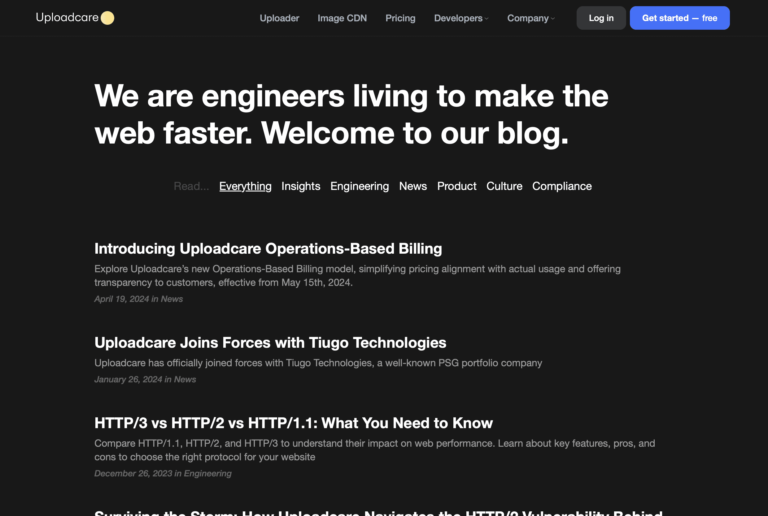
Before
After


We decided to go without covers because there are lots of articles about non-visual engineering concepts. It serves no one to mass-produce meaningless images with logotypes and arrows every time an article comes out. That means, I had to get the headings right. Few dozens of tests and tweaks later, I've come out with something that holds well in various situations.


While fighting headings I found an underrated CSS gem:
It does exactly what it sounds like—it breaks lines to balance their length. Just don't use it on long paragraphs—it won't work after six lines to avoid a performance hit.
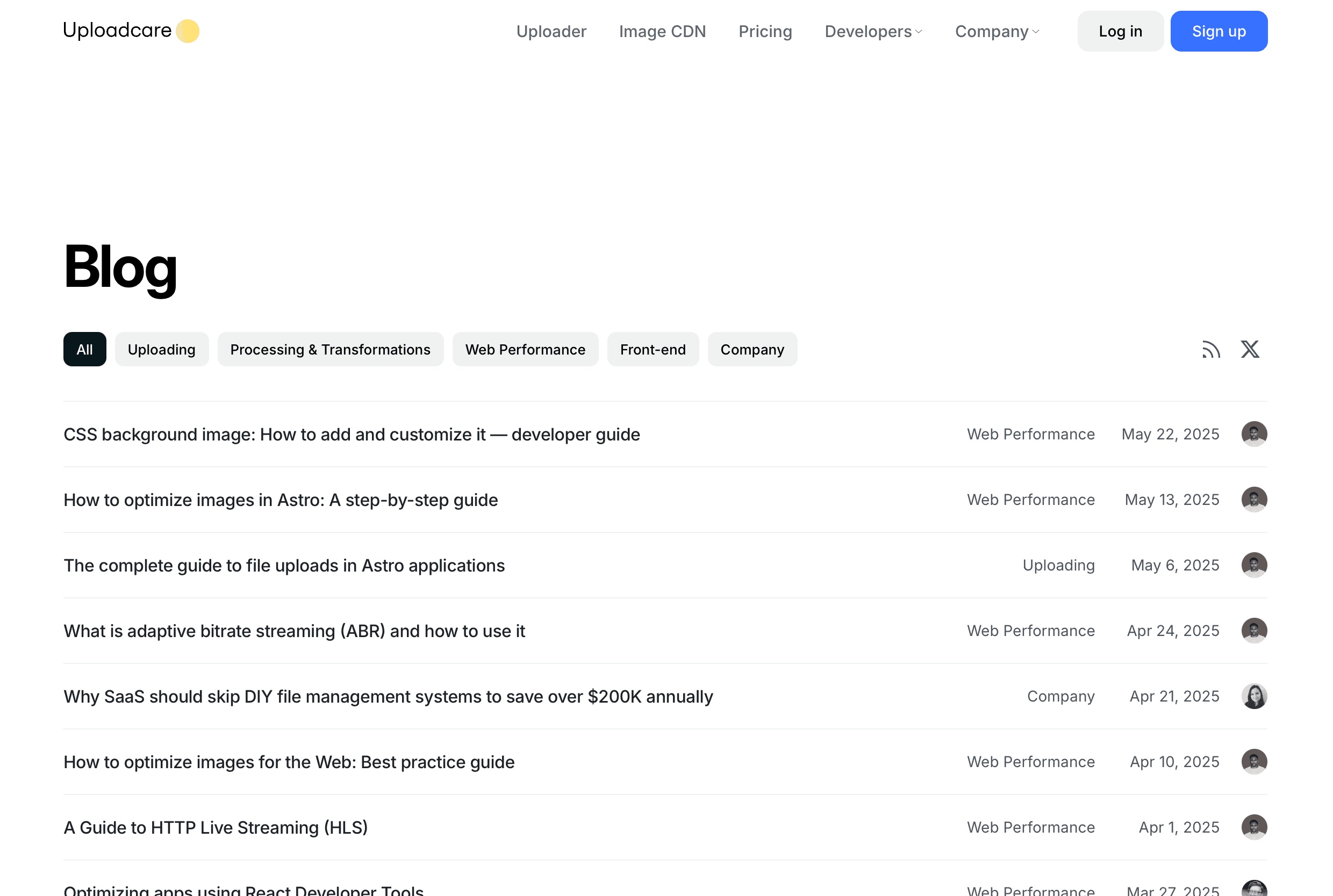
This what the index page looks like:
Before
After
Lastly, here's a look at how the new design handles complex situations with tables, code blocks, and combinations of elements:


